2018 - 2021 | Bukalapak
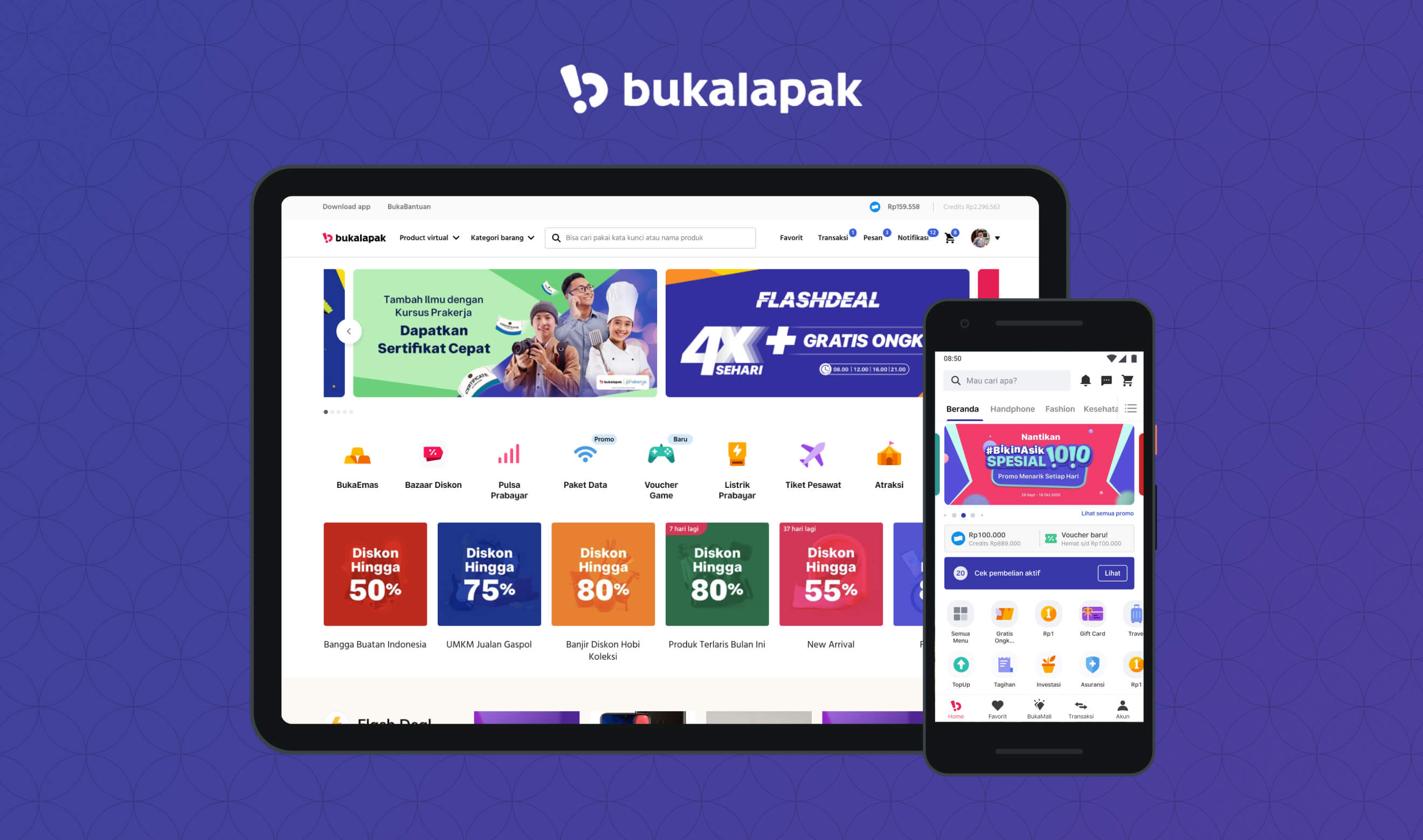
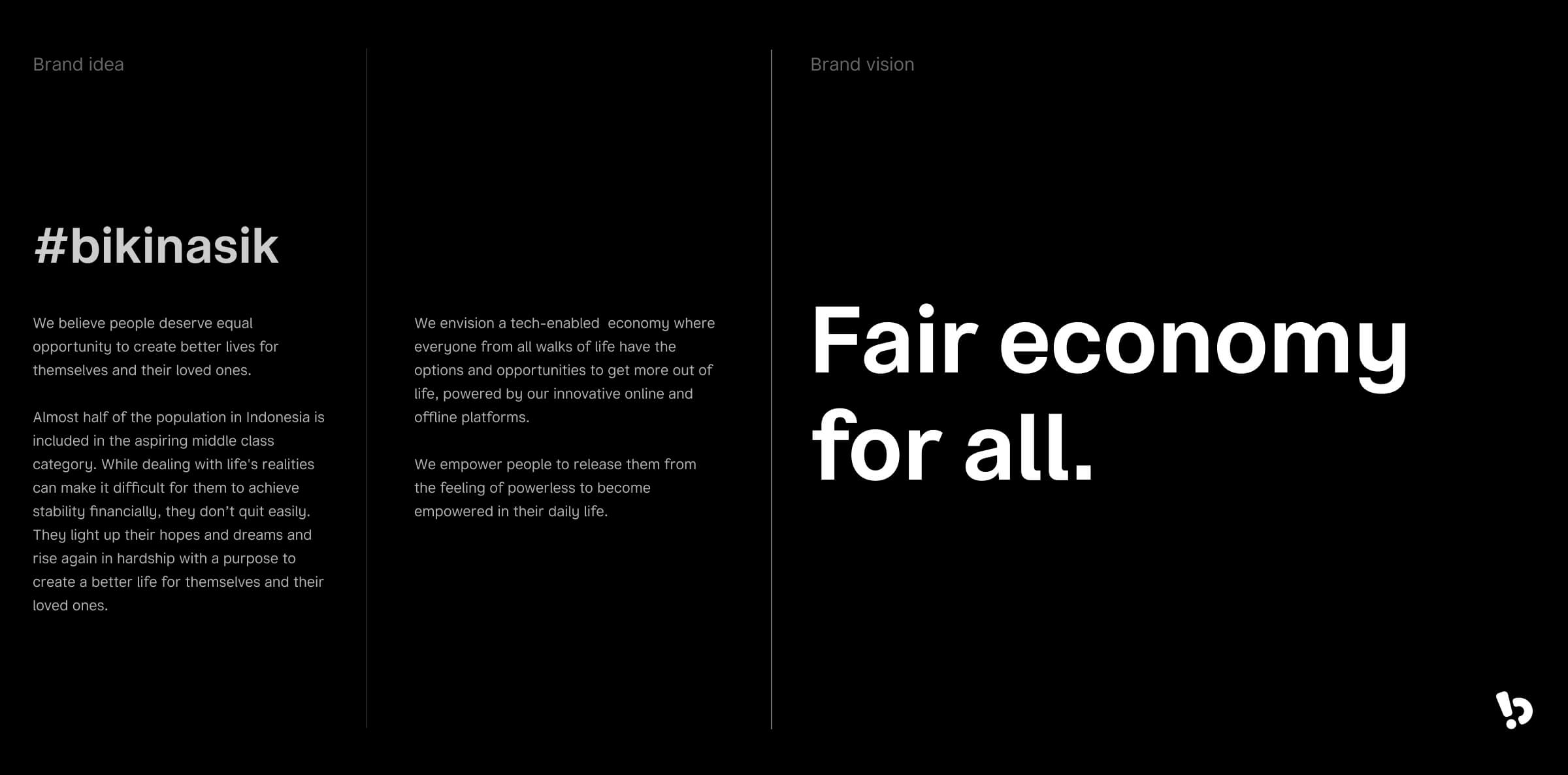
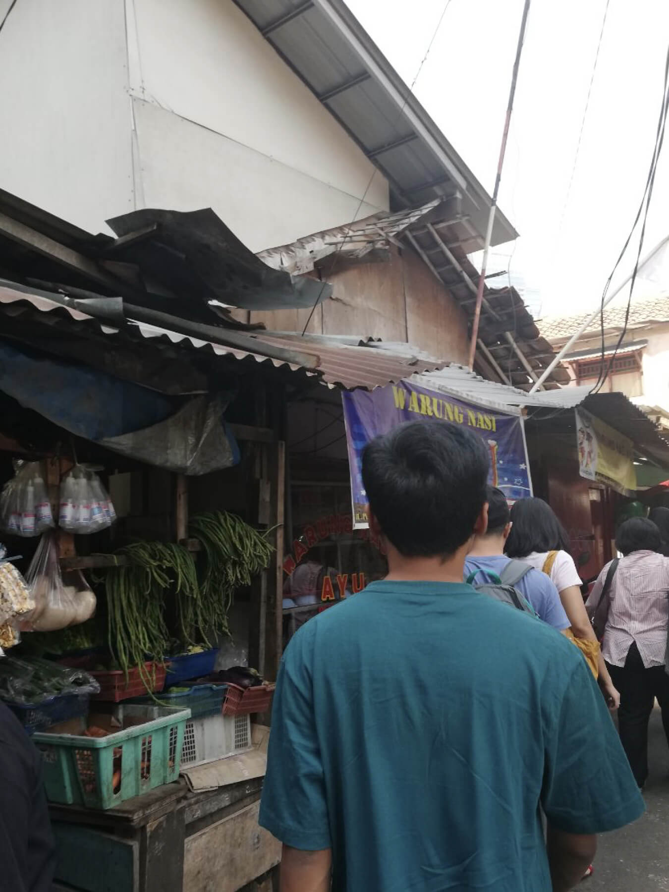
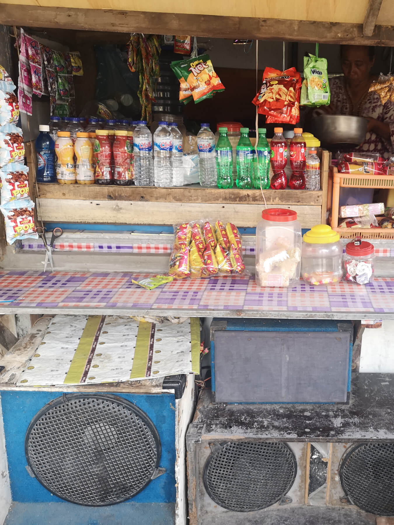
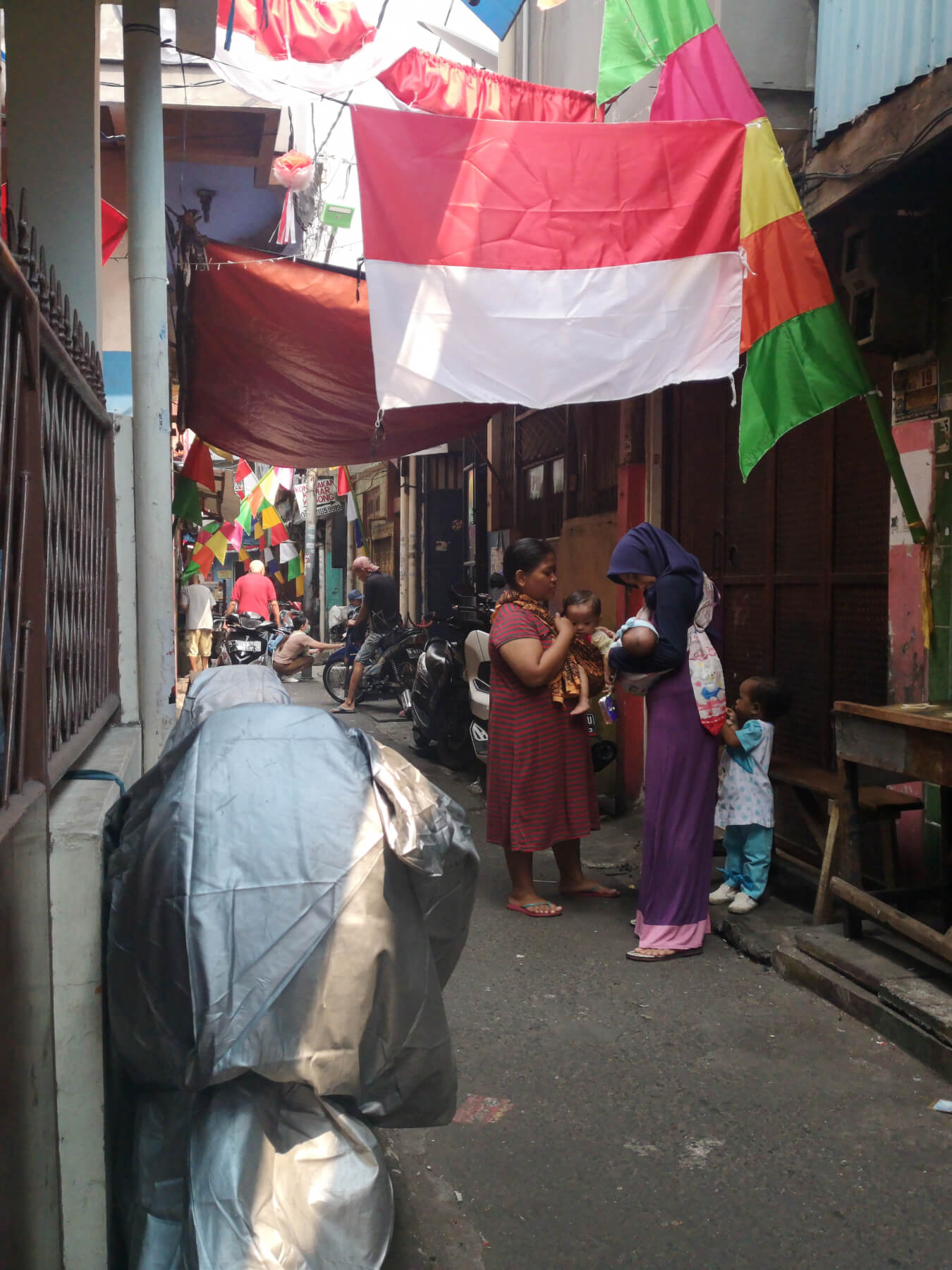
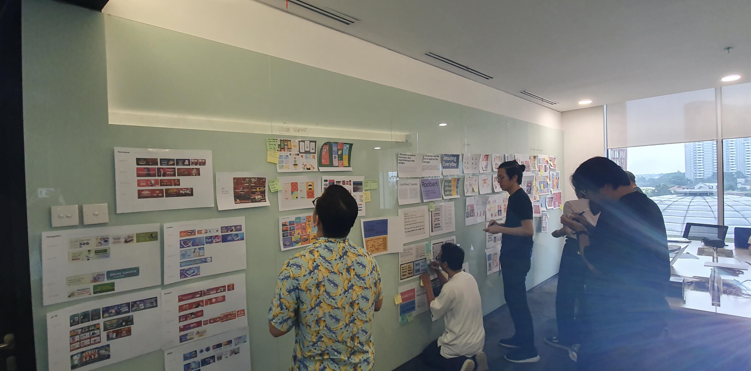
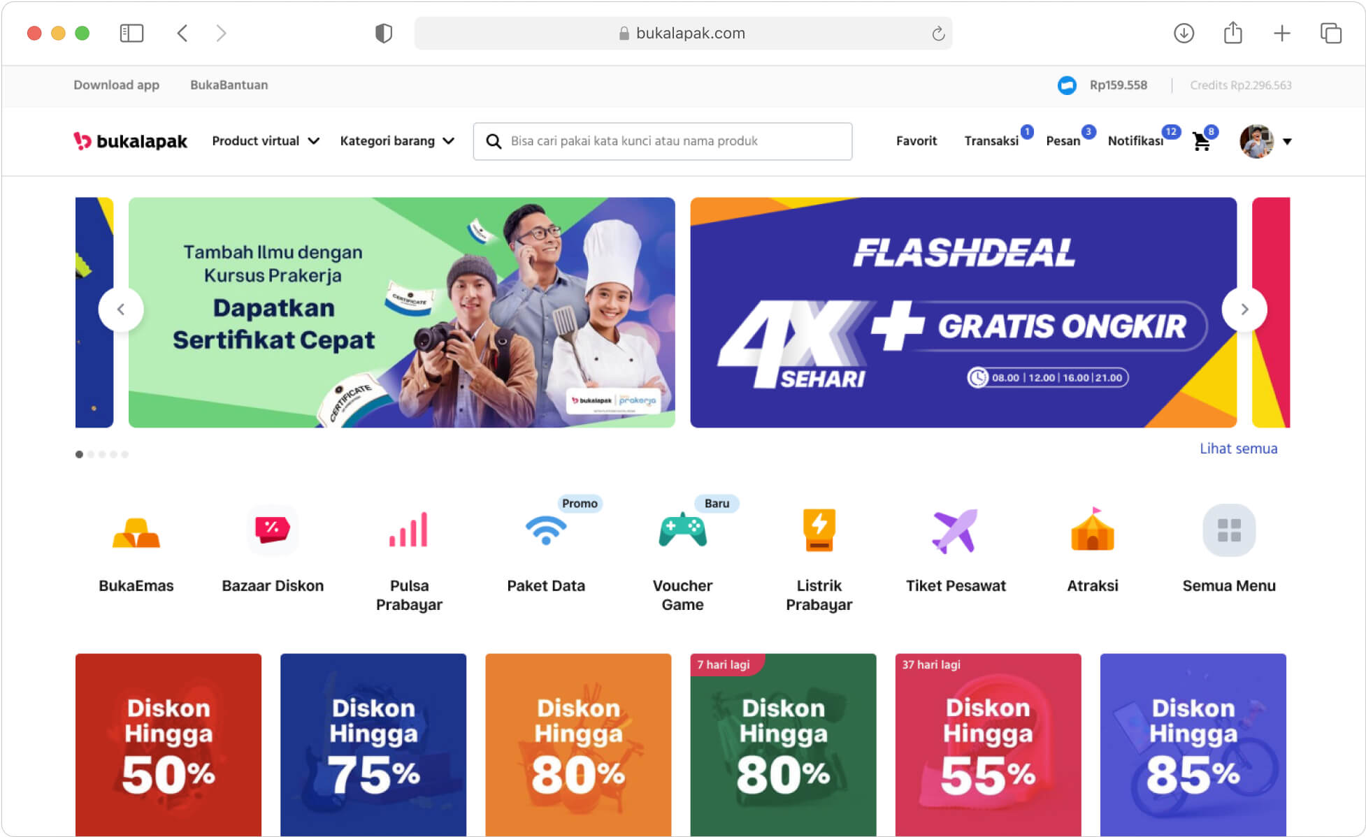
Founded in 2010, Bukalapak has been empowering millions of merchants to run their business in Indonesia. As the company continues to expand the products and services, the team struggled to scale the design language in a cohesive way.
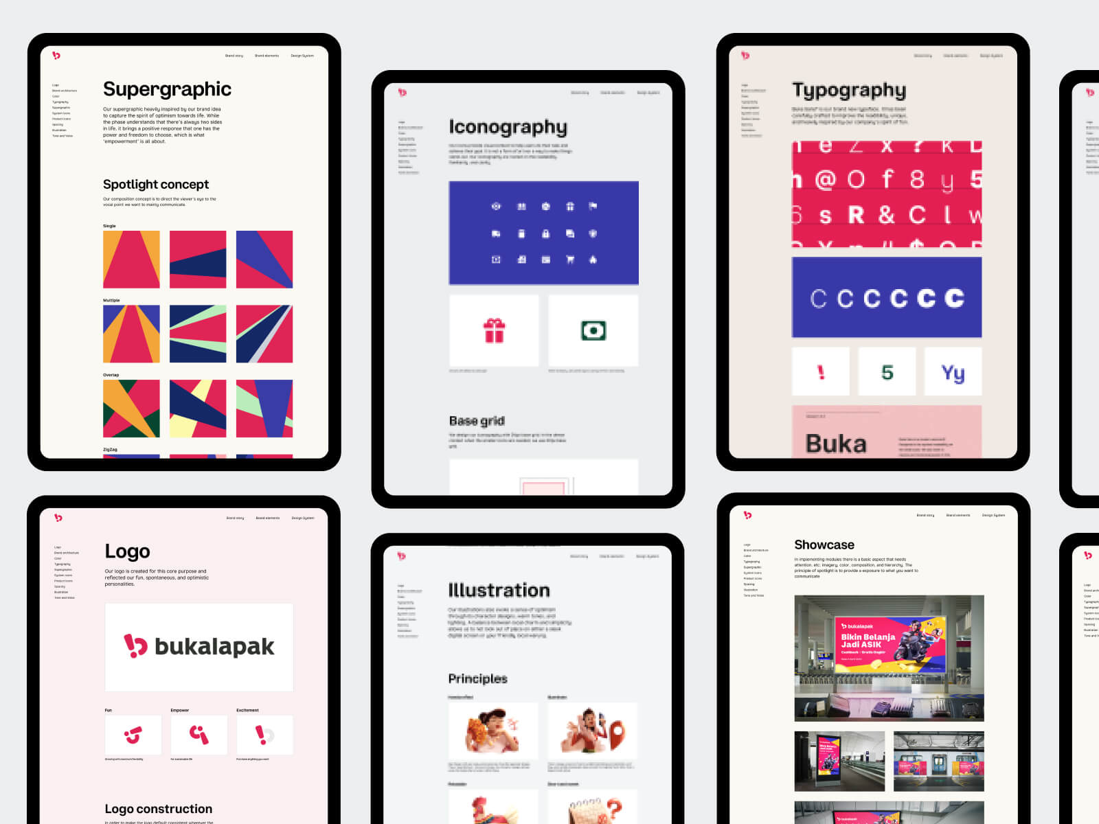
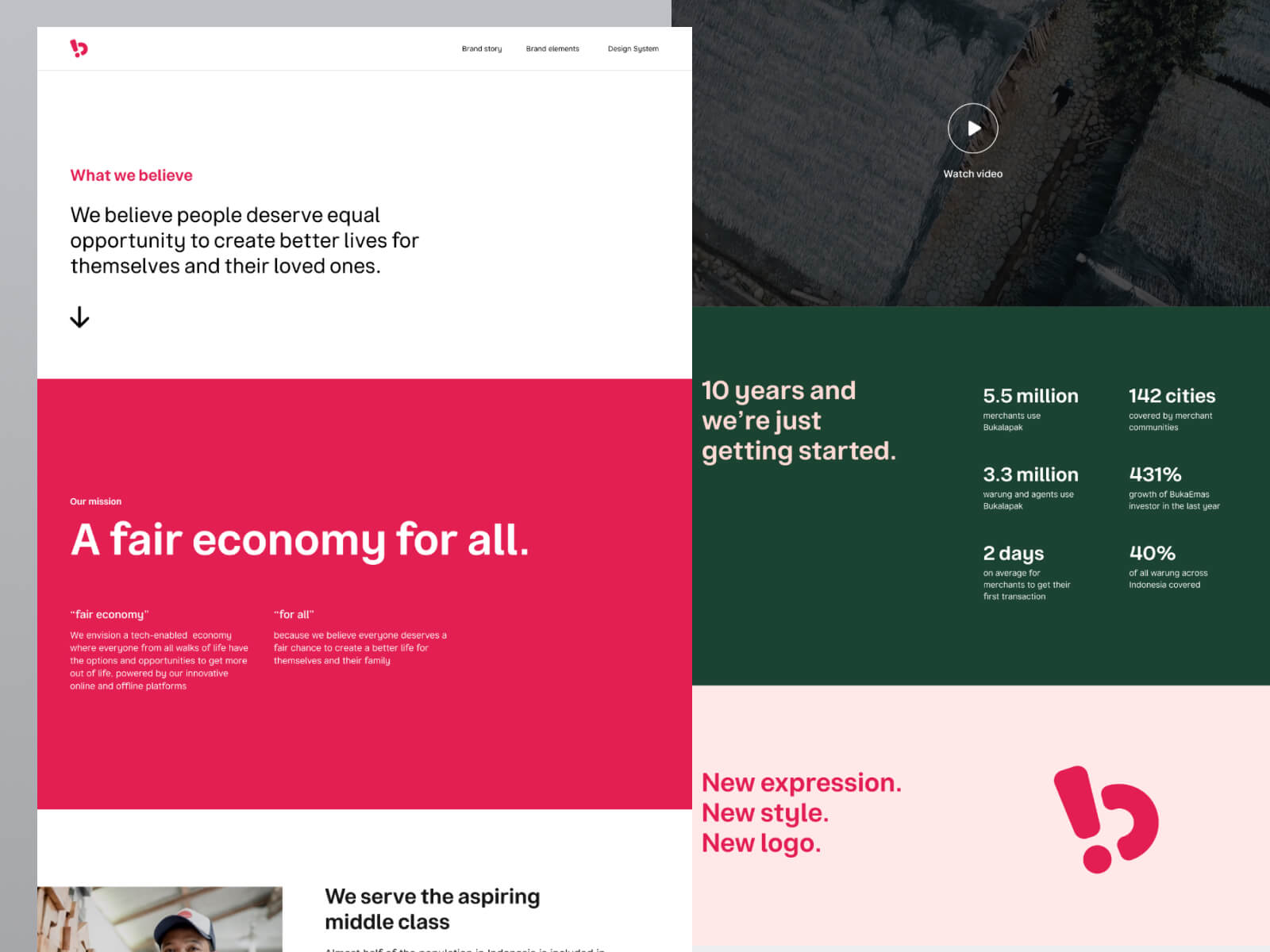
I led the collaborative effort to align the design direction with our vision: to bring a fair economy for all.
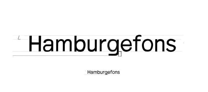
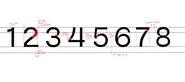
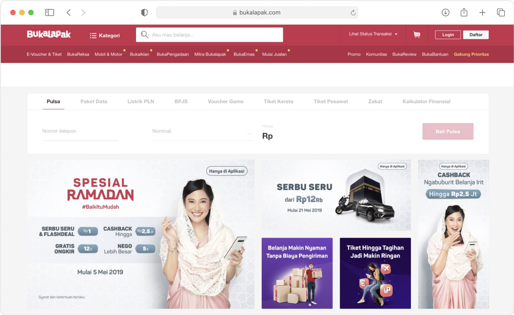
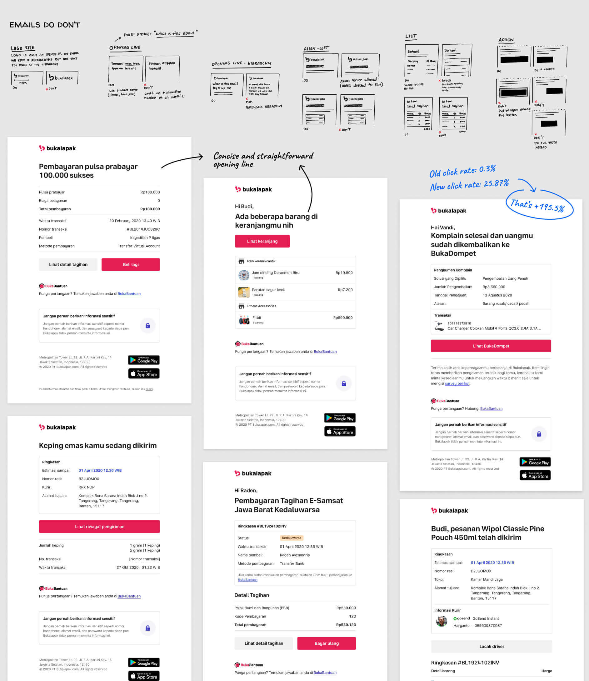
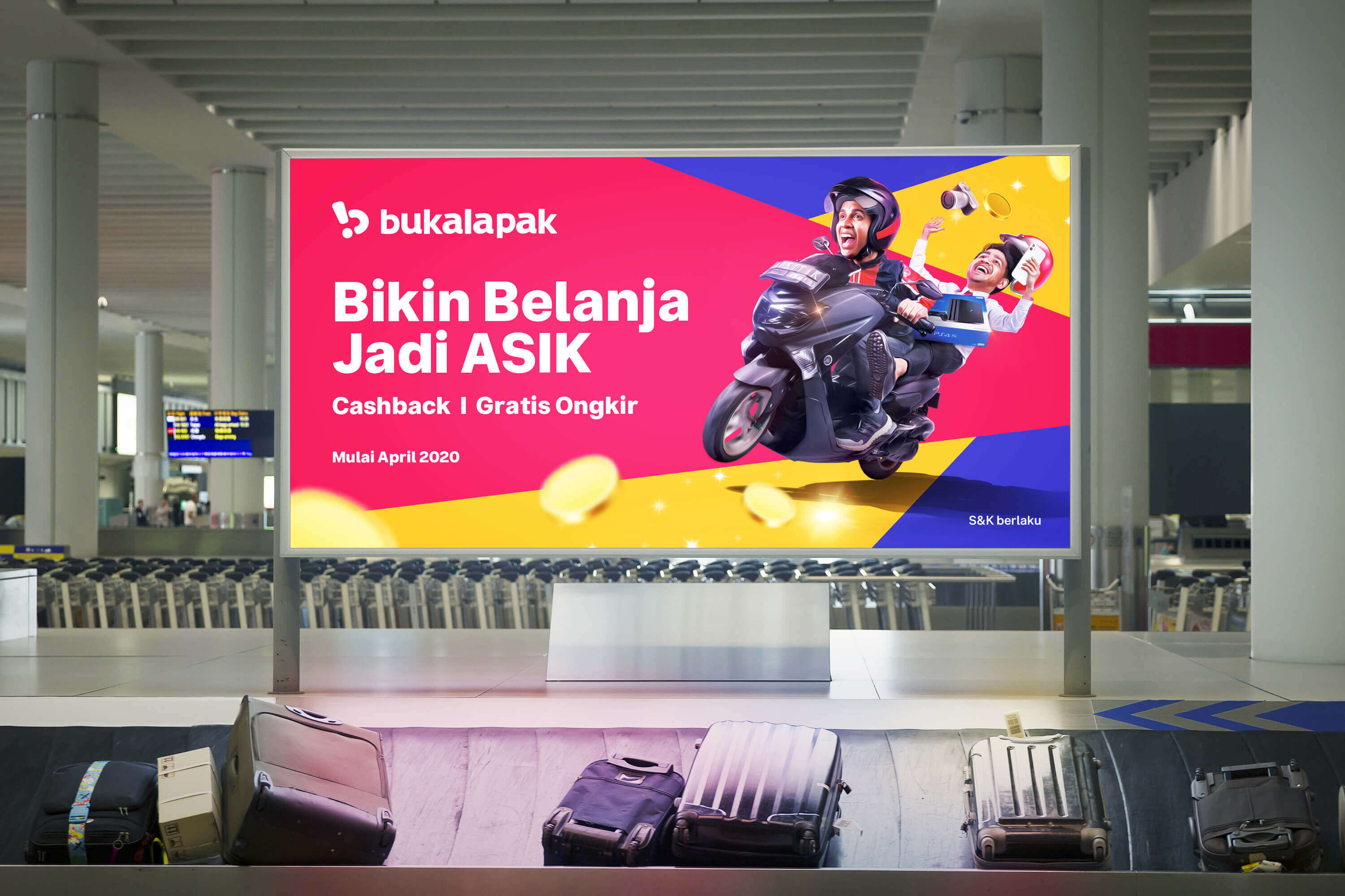
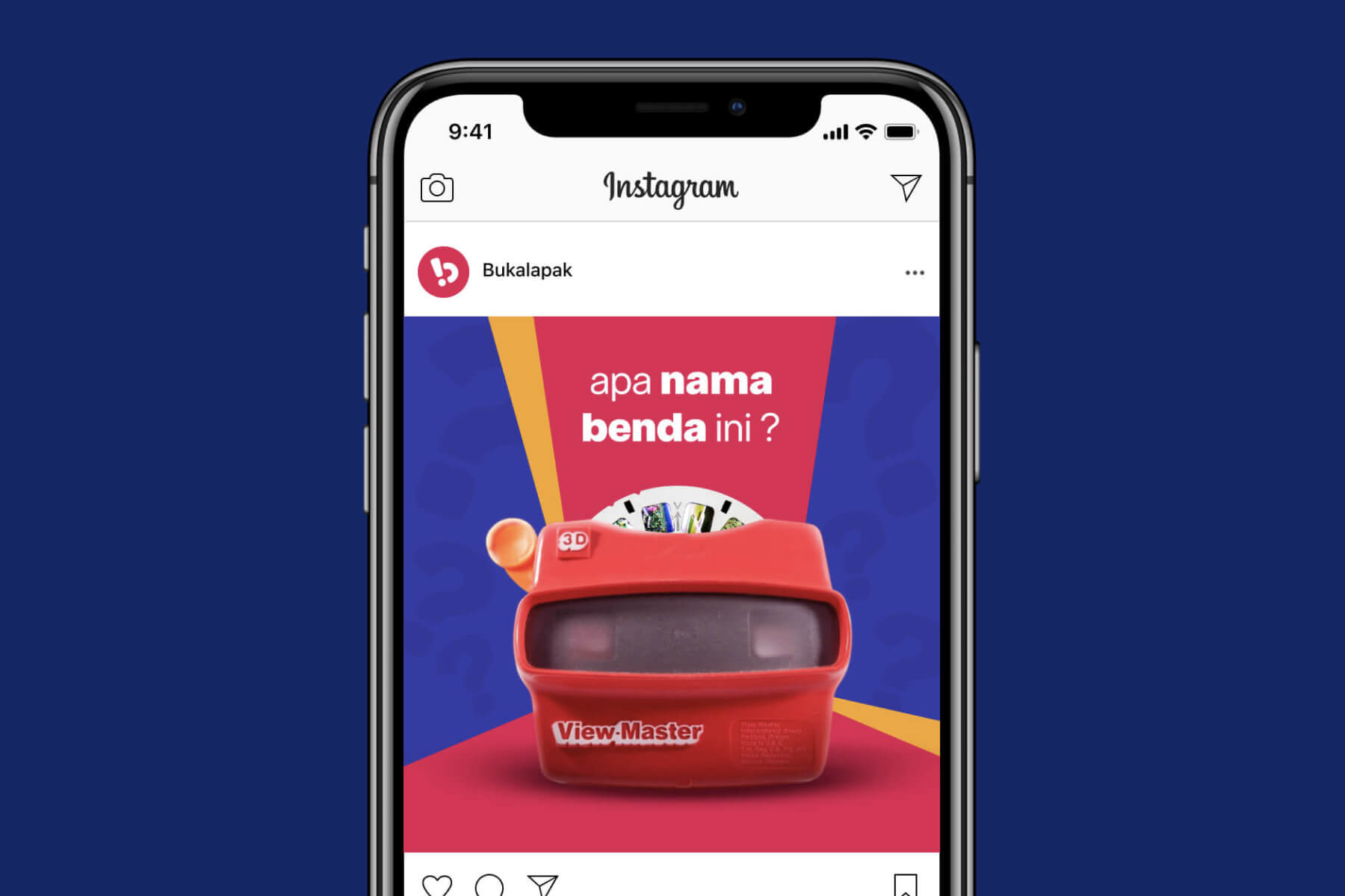
The result is a cohesive design language manifested in a different part of the experience, from offline marketing banners to expressive landing pages. The design language enables teams to expand the design language on top of the foundation we built.
Brand strategy
We took a strategic shift to serve low-income people to set us apart from the competitor. To support that, we conducted a field study to study our target audience. The research helped us identified brand attributes: guiding, optimistic, and light-hearted. Which we used as guiding rails along the way.
I facilitated a 2 days workshop to translate the insights and strategic discussion into our design directions. The research was executed by the internal research team.
Typography
Even though typography is an essential building block, we suffered from inconsistencies. I explored different approaches of typefaces to convey the expressiveness of our brand. I drafted the foundation and collaborate with the agency to turn them into a font that we now use across our platform.
The implementation
Redesign desktop experience
Problem
Many buyers still prefer browsing through the desktop. However, our desktop web design language was outdated compared to our apps. It negatively impacts the experience and brand trustworthiness.
Outcome
Implemented the new design language to improve interaction. We also optimized the infrastructure as a part of collaborative work with the engineering team. Resulting in positive reactions from users and increased GMV by 30%.
While improving the productivity on the shopping experience, we also expanded the design language for a couple of internal website.
Transactional email redesign
Problem
We send about 85.000 emails per month to our customers. Yet, our emails are redundant, outdated in design, and has confusing content. We had a low open rate as a result.
Outcome
We redesigned 300 emails and killed 75 redundant emails. We now have an effective design language for email, more straightforward action, and a personalized subject line. The open rate increased 22% on average for most emails.
Iconography
A new icon request is a part of the operation as the business continues to expand. We built a guild, a handful of designers dedicate a portion of their time to make icons to tackle this operation needs. We had been training designers to create icons. I also built the foundation of the style and the principles to empower the guild to scale this work.
Reflection
01. Convert the findings into principles to help people remember what's important. We used it to guide multiple initiatives.
02. Pave the foundation and let the team across the organization participate is a much more efficient way to work at a large scale.
03. Small and quick iteration with the right set of stakeholders is essential to keep the project moving forward.
Credit for Steve Lianardo, Raditya Pradipta, and Yoel Krisnanda for being the partner throughout this ongoing effort. Also, for Nikita Pradana Wibisono and the illustrator team for the great work on the illustration. Shout out to Edho, Dito, Untoro, and all the marketing design team for the great collaboration. Kudos to Ardhityo, Ardi, and everyone in the icon guild for the effort to operationalize the icon. Thanks to Barata and Mila for systemizing the design language. Cheers to Cedi, Nick Dop, Mezano, and Oji to support the email redesign initiative. Thanks to Nation, ThinkingRoom, and Tokotype for the collaboration. Ultimately, since I couldn't name everyone here, I want to thank everyone I haven't mentioned here to be part of all of this large initiative.