Jun 29, 2021 | by Budi Tanrim
Design system: Auditing color system
Lately, I’ve been trying to audit the color usage.
We have a color palette to use: gray-10, gray-20, gray-30, and so on.
But this approach doesn’t help designers answer basic questions such as: Should I use gray-20 or gray-40 for the separator? One designer might feel gray-40 is better, but the other designer would use gray-20 to make it “subtle.”
This problem becomes worse for other colors. Some use orange for error, and others will use red. The palette gives a list of colors but gives no shared language, leading to unintentional design decisions.
If you’re in this situation, consider doing a color audit.
First, collect all the screens of the core flow of your product. The example of core flow in eCommerce would be: Homepage, product listing, product detail, checkout, and so on. If possible, take screens created by different designers. It will help you identify various incoherent designs.
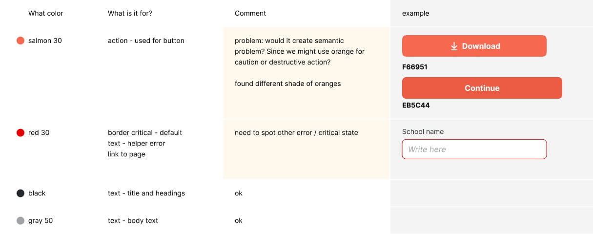
Second, go through each screens and analyze them. For example, I created a table on Figma and wrote down some analysis: What color are being used here? What is it for? Any problem or things that can be improved? You’ll get the current color usage.
This later will help you understand how designers in your company use the color. You will identify differences and potential improvement.
What to analyze?
Accessibility. When auditing the current color, is there any color that doesn’t pass the WCAG standard? If so, should we improve it or keep it? Not all elements need to pass the AA or AAA. The rule of thumb is to ensure small text to pass the contrast ratio.
Identify redundancy. Is there any different color being used for the same purpose? For example, you might see four different colors are used for a border separator. Take notes of this and pose a question: Should we merge them all into one or two colors? If so, why?
Harmony. Color often suggests semantics. For example, red for error, yellow for caution, and green for success. You might want to identify these inconsistent semantics throughout your product.
This analysis is much better approach than just collecting all the different color shades.
It will help you to 1) identify problems of the current color usage, 2) improve the current color rationally, and 3) prepare you to give meaning to the color system.
The goal of a design system is to help designers make a decision. Which color should I use for this?

Hi, this blog is no longer active. I move to substack. You can subscribe below or go to newsletter.buditanrim.co


