Apr 01, 2021 | by Budi Tanrim
Inspecting interface design — Exercise with heuristic
Okay, let’s exercise how it likes to use the heuristic principles.
For the purpose of this exercise, let’s use only these:
Minimize memory load: Eliminate mental calculations, estimations, comparisons, and any unnecessary thinking, to free cognitive resources for high-level tasks. Does the interface minimize the user’s memory load?
Provide feedback: The interface should always keep users informed about what is going on through appropriate feedback within a reasonable time. Does the interface provide feedback when we take action?
Speak natural and simple language: Display data in a clear and obvious manner to reduce decision time and error. Will the users understand the language?
1.
Let’s say we’re working on a mobile game application. We want to introduce a new feature to allow users to play with their friends. Here’s the task:
- As a newbie player, I want to play with my friend.
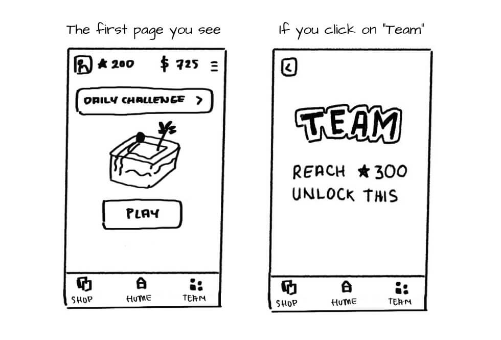
Just use the three principles above. What can we improve here?
2.
Let’s discuss the first heuristic: Minimize memory load. Based on psychology studies, humans’ short memory can easily be overwhelmed, and we want to eliminate unnecessary thinking.
For example, on the “team” page, the interface communicates to the user that they need to get 300 stars to unlock the team feature. Then, it provokes an additional question on the user’s mind: “How many stars do I have now?” Then, the user has to manually navigate back to home and make a calculation.
Looking at the heuristic, we should note this as a potential issue. Although it’s not going to stop users from completing their tasks, it’s an opportunity to improve the experience.
As a result of that thinking, we might land to this improvement:
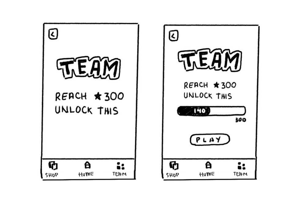
We provide a progress bar, not only to motivate but to show the progress. So, the users don’t have to calculate their own star on the home. A side story here, there is an application I use to buy bitcoin, and every time I want to know how much I gain or lose, I need to manually calculate. Really frustrating.
3.
Next, we might want to look at the “Speak natural and simple language” principle. When the users want to play with their friends, the word “Team” might not be the most intuitive term. Because team suggests some tribe or group.
With this heuristic, we can simply improve the interface by changing the term. To make the experience more intuitive. Perhaps “Friends” will be better?
The Heuristic is a rule of thumb. You can use this to improve the usability of the interface. However, the heuristic will not tell you whether the product is good or bad.
This skill in inspecting the interface is crucial. When you can do this while you explore the work, you can actually improve your work drastically. Later, when you test the interface with the real users, you will test the optimal interface and hopefully capture some of the essential problems that you can’t capture through heuristic.
4.
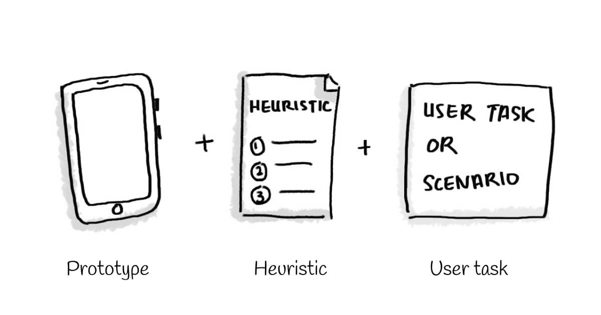
Before conducting the heuristic evaluation with your team. There is some preparation you will need: prototype, some curated principles, user tasks.
Footnotes
- Tan et al., Web evaluation: Heuristic evaluation vs. user testing (2009)
- Doubleday, A., Ryan, M., Springett, M,. Sutcliffe, A.: A comparison of usability techniques for evaluating design (1997).
- Kock E.D. et al., Usability evaluation methods: mind the gaps (2009)
- Jeffries et al., User interface evaluation in the real world: a comparison of four techniques (1991)
- Sears, A., Heuristics Walkthroughs: Finding the problems without the noise. International Journal of Human-Computer Interaction, 9, 213-234. (1997)
Hi, this blog is no longer active. I move to substack. You can subscribe below or go to newsletter.buditanrim.co


